
How we generated a response rate of 63% by ignoring the brand guidelines
What a postman, some beautiful Congolese stamps, and a two-page letter taught us about what donors actually respond to

One of my favourite thinkers, Rory Sutherland, tells a story about the Royal Mail.
On paper, they were doing brilliantly. Their first-class mail was being delivered the next day 97% of the time. A piece of paper, dropped into a red box in London, travelling the length of the country overnight, arriving in Edinburgh before breakfast.
But not every customer was happy. Some thought the service was terrible.
Alex Batchelor, Royal Mail’s marketing director, had commissioned loads of research into the brand’s attributes. The team could never make sense of it. People’s attitudes seemed completely random and polarised. Nothing correlated. They expected late deliveries to drive negativity and on-time deliveries to boost satisfaction. Then they ran one extra piece of research, and suddenly everything made sense.
Customer satisfaction didn’t correlate with reliability at all. The main factor was whether customers liked their local postie. Areas with a less reliable service but a friendly, warm postman or woman often had higher satisfaction than areas with perfect delivery but an impersonal one.
As Rory summed it up…
“If your postman was a bit of a bastard, you didn’t like Royal Mail.”
What mattered wasn’t the visual ID, the advertising or the operational excellence. What mattered was the person who knocked on the door.
There’s a lesson here that needs to be understood by those of us who work in charities. No amount of advertising, no brand campaign, no operational metric can reliably manufacture the goodwill that a real live person can.
The problem is that most charities don’t have a postman.
Royal Mail’s answer was straightforward in theory. Understand that your postmen aren’t just delivering letters. They are the brand, on every doorstep, every morning. Value them accordingly.
Charities mostly can’t do that. They don’t have a researcher who can visit every donor, a volunteer who can greet every prospect, a fundraiser who can discuss legacies with every supporter once they reach their sixties.. Human touch points definitely exist, but for most donors, they are rare. Few donors will ever meet anyone from the organisation they support.
They’ll just receive things through the post or on email.
Which is where this gets interesting. Because if you can’t send the postman or woman, the answer isn’t to give up on human connection. It’s to make the thing you put through the door – or send via email – feel like it came from another human being.
Let me show you what I mean.
In the late 2000s I visited a project in Goma, in the Democratic Republic of Congo. I was there for ActionAid. I took the photographs myself. I met the families. I saw what was happening on the ground.
When I came back, we built a thank you pack around that visit. Two sheets of paper. Simple. No production budget to speak of. But we shipped those letters back to the DRC for dispatch to donors in the UK. It was part of the ActionAid mid-value programme – one of the most successful campaigns I have worked on. They had a significant number of mid-value donors, which gave us the opportunity to do something special.
But when the envelopes arrived we got a surprise, they were covered in extraordinary Congolese stamps – vivid, chaotic, completely unlike anything dropping through a British letterbox on a Tuesday morning. We hadn’t planned it as a device. It just was what it was – a letter that had actually travelled from the DRC, covered in the evidence of its own journey.
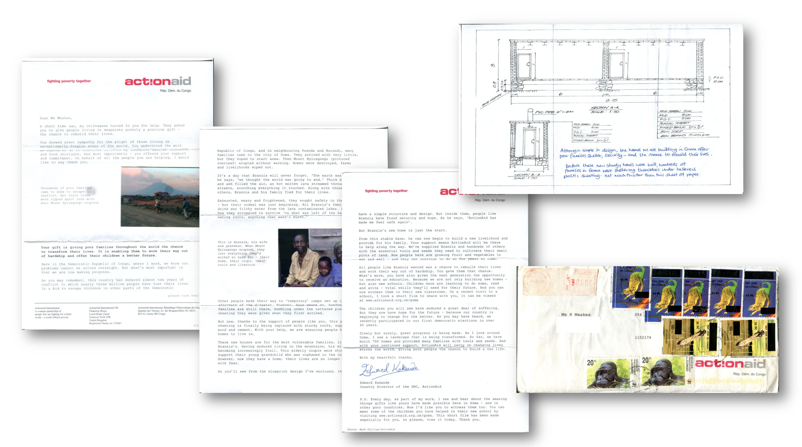
It generated a 63% response rate. No response form. No URL. No QR code.
Look at that pack now and you’ll see it would break so many brand rules laid down by comms people who don’t understand fundraising. No art direction. An envelope covered in foreign stamps that nobody planned. Typeset in Trixie. Hand writing. Glue marks coming through the paper where the photographs were stuck on. By every metric that a rigid brand demands, it’s awful. Where is the brand? Where’s the hierarchy? Where are the palette and fonts?
That’s looking at it the way Royal Mail looked at their delivery statistics. Measuring the wrong thing entirely.
The best fundraisers get it immediately. They don’t need it explained. They feel it – because they’ve sat across a kitchen table from a donor, or stood at a door in the rain, or watched someone read a letter and reach for their cheque book. They know what moves people. It isn’t polish. It’s the sensation of being reached by another human being who actually made an effort to reach you.
Great fundraising has always known this. Fundraising isn’t advertising. People might buy things from companies, but people give to people.
In our research, we always make sure we talk about helping behaviour – not just giving. This expands the conversation very usefully. Do this and you’ll find, particularly amongst wealthier older mid-value donors, that their richest experience of charitable behaviour comes from directly helping people. I was talking to a friend who recently retired and now volunteers at the Citizens Advice Bureau. No pay. He actually does more days than he’d like, but he’s helping people living on the streets he grew up on. And it’s more rewarding than the ten-pound direct debit he gives to Shelter.
This is what frustrates me about brand guidelines. They are created by agencies trained to make things look expensive, with high production values, with everything looking the same. It isn’t authentic. It isn’t real. It isn’t human.
The fact is, most over-zealous application of a set of brand guidelines enforce sterility. Just a visual monotone where nothing is remarkable. Nothing surprises or delights. It just fits in.
The stamps on that envelope weren’t a design choice. They were proof. Proof that someone had actually been there. Proof that this wasn’t part of a strategy. No amount of brand guidelines, no mood board, no creative tissue session produces proof.
That level of connection with the work matters. Going to the project and sharing that experience produces the evidence that donors respond to.
Stop making packs look like ads. Make them look like letters.
This is so simple it shouldn’t need saying. And yet here I am.
Look at your last donor mailing. Really look at it. Does it look like something a person sent to another person? Or does it look like something a marketing department signed off, a designer designed and a brand guardian approved? Where is the hand of a real person.
Because donors can tell. They always can. They just try to ignore that feeling. In discussions with donors about why they might give to one appeal and not another, the answer you hear time and again is – one felt like a letter. The other felt like an ad.
Letters come from people. Ads come from organisations. And however much an organisation wants to be trusted, however worthy its cause, however brilliant its work, the moment it starts communicating like an organisation rather than a person, it has already lost something it will have to spend a fortune trying to get back.
The same is true of email. Possibly more so.
Stop sending emails that look like they were designed. Stop with the header image, the brand banner, the colour-blocked call to action button, the unsubscribe footer that takes up more space than the message. That is not an email. That is a brochure that arrived in an inbox. And people treat it exactly like a brochure – they glance at it, feel nothing, and move on.
The emails that work look like they came from you. Plain text. A real name in the from field. A subject line a person would actually write. Something in the first line that makes the reader feel seen rather than targeted. Add a picture or a screenshot of a relevant newspaper article. The odd typo? No problem.
Not a template. A thought.
Not a campaign. A conversation.
Since the advent of emails as a medium, the technology has always existed to send emails that look like a personal note. Almost nobody uses it that way because it seems old fashioned. Instead they use it to send emails that look like something you receive – and ignore – from Netflix, your bank, or the supermarket, then wonder why engagement is falling.
Your donors have a person in their life who writes to them occasionally about something that matters. That person gets read. You have the same opportunity, every single time you hit send – and most organisations throw it away in the name of brand consistency.
Be the person. Not the organisation. A letter from a human being. An email from you. That’s it. That’s a massive part of your fundraising strategy.
Forget the brand book. Forget the Pantone.
There’s a version of this conversation where someone from the comms team gets angry – “but we have brand guidelines. We have approved fonts. We have a style guide. Hand writing simply isn’t allowed.”
Let them be angry.
Precise brand consistency is a tool built for companies selling products to consumers who need reassurance that the thing they bought last time is identical to the thing they’re buying this time. It exists to reduce anxiety in a commercial transaction.
That is not what a donor is doing.
A donor is not buying a product. They are placing trust in a person – or in the idea that there are people, real ones, doing real things, in real places, with their money.
The thing that reassures them is not a consistent typeface. It is evidence. It is warmth. The unmistakeable sensation that a human being thought about them specifically, and created something, and sent it.
The Congolese stamps didn’t match anything in the ActionAid brand book. They didn’t need to. They were better than anything in the brand book. They were real.
Charities are not Coca-Cola. They are not Apple. They shouldn’t be trying to make you feel the same frictionless brand sensation every single time you encounter them. They are trying to make you feel something true. That the world has a problem, many problems, but that people are working on them, that your money is going somewhere that matters, into hands that need it.
That truth is not communicated by getting the kerning right.
It’s communicated by a photograph taken by someone who was actually there. A letter written by someone who actually cares. An envelope that looks like it travelled, because it did. A PS that sounds like a person because a person wrote it.
Every penny counts in a charity. Donors know that, and they respect it. An appeal that looks like it cost a fortune signals the wrong thing entirely. A pack that shows someone knows about the donor and the work, that someone cared more about what was inside than how the outside looked is the pack that gets opened, read, and acted on.
Stop trying to be a corporate brand. Start trying to be real. Start trying to be a charity.
Of course charities need a logo, a brand colour, a couple of decent fonts (as long as one is serif). But the best fundraising has always looked a little rough around the edges – a little ugly – because the best fundraising has always been made by people who were too busy changing things for the better to worry about whether the logo was really the right shade of red.
Get the authenticity right. Everything else follows.
If you can’t send the person, send something that carries their fingerprints.
When you’re creating your next mailing, ask yourself these questions:
Does it feel like it came from a person? Not an organisation. Not a brand. A specific individual with a name, a reason for writing, and something to say. If the letter could have been written by anyone, it was written by no one.
Is there evidence of a real journey? The stamps were proof of travel. What’s yours? A photograph taken by someone who was actually there. A detail that only an eyewitness would know. Something that says: a human being went somewhere — someone’s home, a street, or a different country — and is telling you about it.
Does the envelope earn its opening? The ActionAid envelope demanded to be opened because it looked like nothing else that had landed on the doormat in years. It had to be opened. By any definition of the word, it was remarkable. What makes yours irresistible rather than invisible?
Does it contain something unexpected? Not a gimmick. Something that signals you thought about this donor specifically. A handwritten PS. A detail from their previous gift. A small enclosure with meaning rather than production value. The unexpected costs almost nothing and signals everything.
Royal Mail didn’t have a brand problem. They had a problem that was about people. Great postmen and women gave customers a great experience. Poor ones gave the opposite. They learned that the postman was the brand.
Most charities have exactly the same challenge. And exactly the same opportunity.
They can send an appeal that ticks every box in the brand guidelines. Or they can send an appeal that look like it was created by a real person for another person - the donor - who matters.
When the postman drops that letter through the letterbox, make sure it’s worth picking up.
As you may know, I worked in ActionAid some time after you. In AA Ireland, we had a nice loyal base of child sponsors giving at above-average rates for regular givers in Ireland. There was a smaller base of 'community sponsors' - not so loyal of course - the name gives away the nature of the relationship or lack of it.
While I was there, some genius in ActionAid International decided that it would be more efficient to post the packs containing letters from sponsored children in the country of the sponsors, rather the country in which the children lived. I've no doubt that the postage was cheaper, but it was not necessarily more efficient - staff time is more expensive in donor countries of course. But it removed the authenticity of the pack that used to arrive with lots of exotic stamps, an air mail sticker, and sometimes a bit worse for wear. Because it was an update with no hard ask such as an upgrade, we couldn't directly measure the effect it had on donor sentiment, other than anecdotally - I wasn't there long enough after that to measure the effect on attrition. But I've no doubt that it weakened the connection between child sponsors and the children and communities they sponsored.
Now, they don't even accept new child sponsorships in Ireland anymore and their standard regular giving option has no special proposition around it. On the AA UK homepage, there is no RG option on the embedded form and it's only if you root around that you can find one. If you go to "Get involved", the only RG option mentioned seems to be payroll giving. It's an awful shame for a charity that spearheaded regular giving.
"Stop making packs look like ads. Make them look like letters." Yep, and unless a strapline really adds value - i.e. getting the pack opened,- leave it out. Who puts a strapline on an envelope containing a genuine letter? Come to think of it, who sends a genuine letter in a C5 window envelope?